CASE STUDY
Subsify 2.0
Concepting and leading the research and design of a globally used ecommerce CMS.
Role
Lead UX Designer
Lead Researcher
Duration
July 2015 -
April 2016
The Challenge
In 2015, the digital marketing landscape gave the publishing industry great success selling physical and digital media subscriptions through online channels. Our agency had created Subsify, a proprietary ecommerce CMS that provides users with the ability to create their digital ecommerce campaigns, all with minimal technical knowledge and overhead.
Through close communications with our clients, we were beginning to learn how inefficiencies in the system created inefficiencies and delays in launching campaigns — thus obstructing their goal of maximizing their subscription sales. Something needed to be done.
This is how I concepted and led the UX redesign of the CMS that would help our clients achieve their goals.
The Team
I concepted and led all experience design and research efforts. I collaborated with two full stack developers and also a project manager.
I presented all research and design work to the agency's CEO and owner, the product owner, and other key stakeholders.
Discoveries
While working in a relatively small agency, I needed to wear several hats including handling both internal and client-facing design needs, and also handling client services. The close relationship that I formed with our clients, the actual end-user, helped shed light into the day-to-day activities and usage of our product. I observed concerns and issues that they believed were erros they had made while entering content into the CMS.
Extending past the phone calls where I would help clients with their issues (thereby learning about the usability issues), I wanted to formally discuss these issues directly with them. I met with local clients in person where we would be able to discuss their experience using the CMS, and also to observe their use of the system. The majority of clients were very interested thinking that the system may be updated as a result of these discussions and observations.
Usability Observations
As part of the initial research, I needed to understand the behaviors and actions users were doing that caused them to arrive at their moment of frustration.
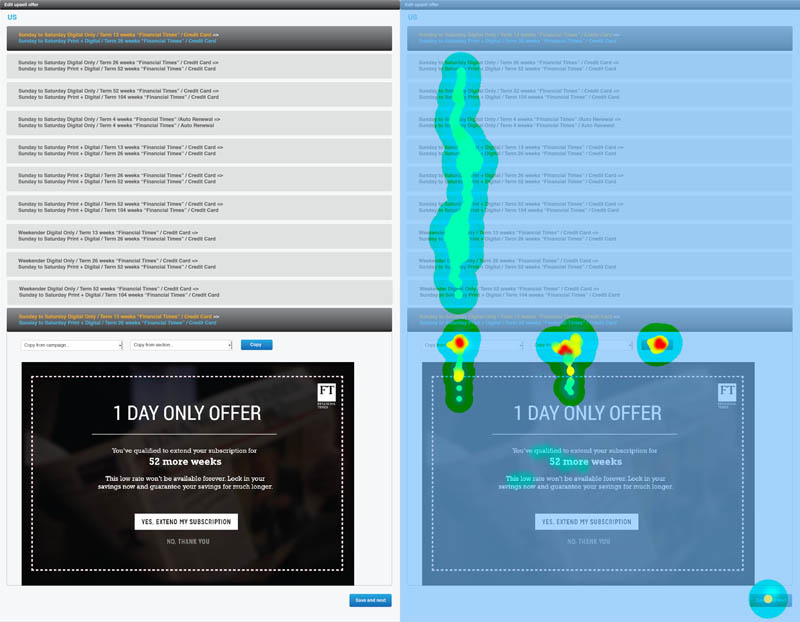
I used ClickTale software to examine, track, and document clicks on pages while performing specific tasks.
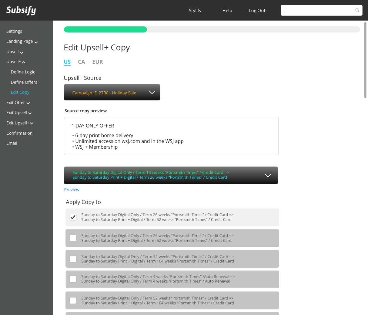
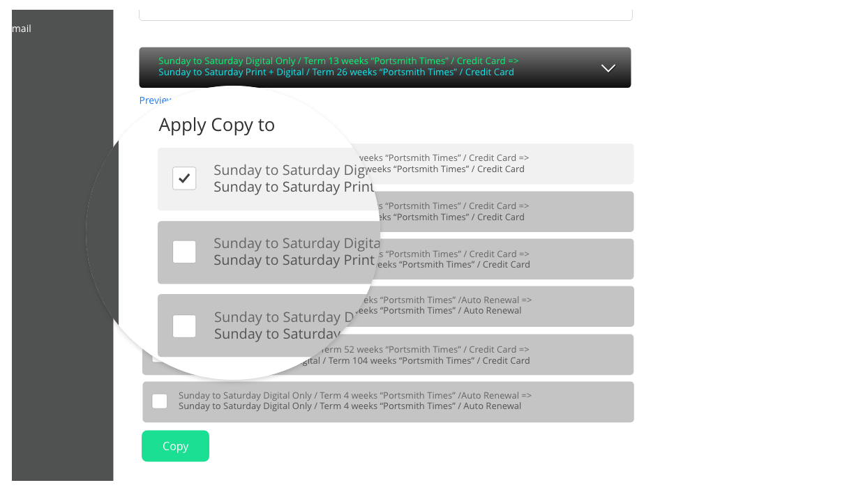
One key area of focus that surfaced numerous times across various clients was the copy feature. Upsell offers are series of extra offers presented to customers who have just made a purchase. Some of the popular upsells offered to customers were extending subscription lengths and subscribing to similar publications.
With the number of upsell opportunities per offer, the number of pages to build can expand exponentially.

Subsify simplifies this process with a copy feature. Users essentially select an offer that needs copy, select a campaign which they know already has copy, and then select the offer containing that copy.
The interviews and usability observations indicated that this process was convoluted.
"I see that there are campaigns available for me to select from, but how do I even know that there is copy from that campaign? Why can't I see what I'm copying over?"
Anonymous participant
"This campaign is huge! We're testing various offers to see which path is most effective, and also which offer is performing the best. It's nice to be able to copy the copy from one set to another, but it's very physically straining and monotonous. I'm sure I've missed [applying copy] to some..."
Anonymous participant
Documenting our learnings
The need to offer my clients a more usable product that spoke directly to their needs and goals, and addressed their frustrations, became almost a personal crusade for me. I decided to take my knowledge and put it into action. That would mean needing to sell this idea to the agency. In doing so, it meant redirecting valuable development resources into this new project, assets that the agency was very protective of. The case for a redesign would have to be absolutely air tight.
As a starting point, I wanted to bring to light the issues that clients were currently facing, as well as some ideas they had that would make for a more enjoyable, and more importantly, a more productive experience. I established the primary user insights and documented them.

I needed the key stakeholders to empathize with the needs of their clients as much as I had been. Sharing the goals and emphasizing their struggles helped in doing that.
Goals
Produce campaigns with fewer errors
Make campaigns faster
Increase conversions (even moreso)
Needs
A fun and easy to use platform
A sense of completion
Time, physical, mental efficiencies
Frustrations
Repetitive mind-numbing tasks
Unclear system notifications
Difficulty locating actions
Buying In
After compiling and finalizing discoveries, in July 2014 I met with leadership at our agency and presented our discoveries.
Our vision for Subsify 2.0 was ambitious: Create a simpler, faster experience rooted in a modern design system that is goal oriented, fun, and easy to use. Not only did leadership find that our discoveries were eye-opening, but our mission statement for the agency was also well received: increase client satisfaction, increase revenue, and use the 2.0 design to help build our clientele..
After some discussion, we received the go-ahead to proceed with the redesign. Our goal was to deliver a usable product by the third quarter of 2015.
Laying the Foundation
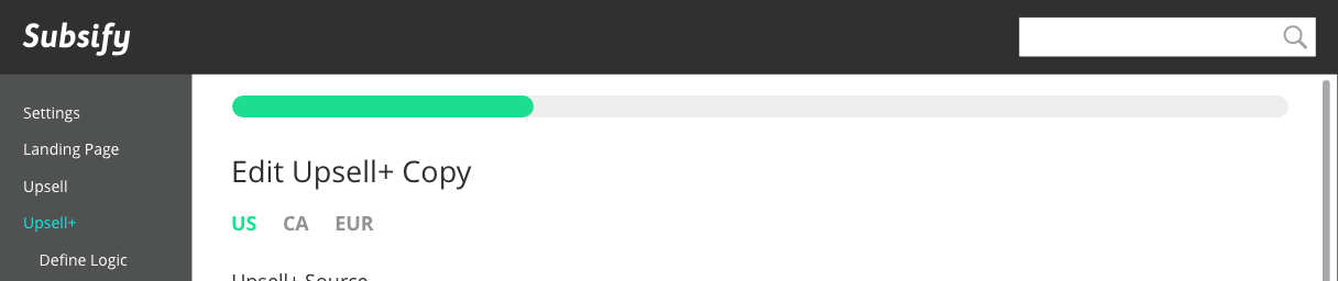
At the heart of this redesign was a need to present a more modern feeling interface. I started to document all of the components that we would need to account for in our design system including color schemes, fonts, controls and menus. The design system expanded as the need called for it. Creating the design system first allowed us to move right into high fidelity comps.

Better management
The project manager and I had been reading Get Agile! Scrum for UX, Design & Development, an introductory book to the Agile approach and Scrum methodology.
Our agency had traditionally implemented projects via a Waterfall approach. For smaller projects, this had not been an issue. However, with this larger scale project and the time frame that we had given ourselves, we wanted to try a new approach that offered us deeper insights into the work being developed, and also would allow us to design in a more organized way.
This was risky since we would need to juggle educating the team on the new methodology, ensuring that we are doing it correctly, and delivering the product on time. We believed, though, that the time investment would be worth our while since we could carry these learnings into different projects.
In accordance with the project plan that we had agreed to, design sprints ran two weeks ahead of development sprints. Development sprints typically lasted two to four weeks.
Putting Solutions to the Test
Before rolling out 2.0 to all of our clients, we needed to know if the new designs were indeed resolving the issues that our clients initially described.
We had been running at a very fast pace with our developers. At the rate we were going, we felt that sharing the test environment with participants would give us the most meaningful feedback as opposed to a prototype study or by using lower fidelity assets.
We were able to recruit five participants for the study. All of the participants were located in New York City, worked within the publishing industry, and had used our CMS. We met in person with our participants, observed their use of the CMS and also asked them to speak freely about what they were experiencing. We recorded the sessions using QuickTime screen record and also a GoPro camera to record participants.
We had assigned participants with tasks to complete based on the new designs. The tasks were based on typical information entry that the clients were already familiar with. We asked them to
Designs to test
The progress bar was something we were very excited to test. We did not have a specific task assigned to this feature, but we did get a lot of positive feedback from participants.
"I love how the progress bar shows how much more I have to go to complete my campaign!"
Anonymous participant
"Oh, this is nice. You know, before, I would often get lost in these pages because everything looks so familiar. I would have to exit what I was doing and check the [section titles] to know which section I was working in. This indicator lets me know relatively where I am and how much is left."
Anonymous participant
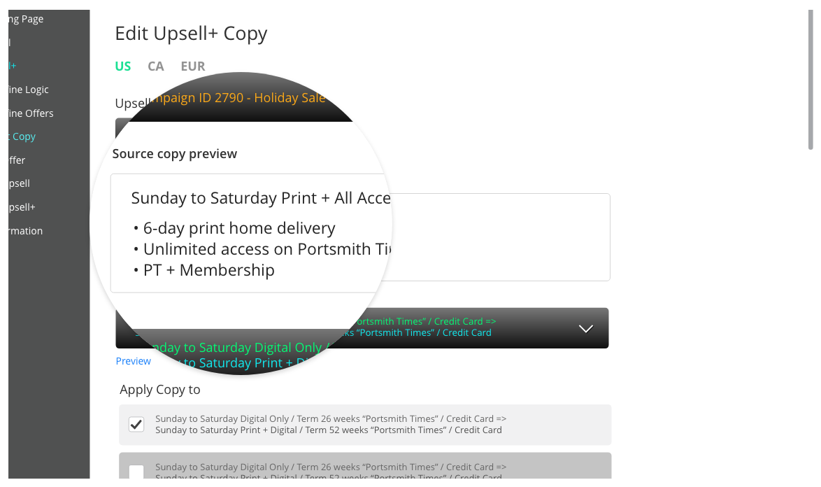
Reducing errors when copying offer text from one campaign to another was another high priority. This meant needing to make the source text visible to ensure the correct text is being copied. I introduced the "Source copy preview" section which plainly displayed the source text giving users a sense in confidence when copying that text.
We wanted to also make sure that we adressed ergonomics issues when completing actions, specifically reducing clicks and repetitive mouse movements.
Results
For the copy function task, we observed participants completed tasks with much greater ease. Our hypotheses that our solution would reduce mouse travel and reduce repetitve actions were validated.

The majority of participants enjoyed the updates that we had made and were successful in completing key tasks. We also learned that with a study like this, "moving the cheese," is a real phenomenon where users are so used to performing an action one way, that anything new causes some time for adjustment. The time to complete actions and what we deemed "successful completions" needed to be taken with a grain of salt.
We decided that we would need to let the product launch live to a test participant pool first and let them use Subsify 2.0 over a period of time. Then we would reconnect with them to gauge their experience.
Presenting... Subsify 2.0

What's Next?
At the time this case study has been written, we are aiming to roll out Subsify 2.0 to all users worldwide by the fourth quarter 2015.
I am grateful to have had the opportunity to work so closely with our end-users. We gained valuable, rich insights about the way they were using the product which helped us to design a more usable product. We had some audacious goals in mind but with careful planning we were able to keep moving forward.
See More Work
Site designed and developed by Dennis Go, © 2021. All rights reserved.