CASE STUDY
UPS My Choice
By 2020, the package tracking landscape had broadened significantly. UPS needed to stay competitive by offering a more comprehensible and useful application.
This is how I led the research and design of UPS’ tracking application that helped to achieve their goals.
Role
Lead UX Designer
Lead Researcher
Duration
February 2020 -
January 2021
The Challenge
UPS’ original tracking application provided customers with insights into in transit packages, and afforded them with the abilities to change the date or location of the delivery. However, the experience proved to be difficult to use and complex to understand which led to low engagement and ultimately a product that was not very useful to customers.
In order to remain a leading force in the increasingly competitive logistics and package tracking landscape, UPS would need a solution that would help increase customers’ engagement, make more use of the delivery tools provided, as well as provide greater value to the business. In Q1 2020, I was brought onto the project to help achieve these goals.
The Team
I led all design and research efforts throughout the project’s lifespan. I managed two UX designers, one design researcher, and also collaborated, and led frequent work sessions with, a content strategist and two front-end developers.
I presented all research and design work to stakeholders from disciplines including marketing and development. With the help of our project manager, we were able to adhere to a 2-week sprint schedule throughout.
Discovery
In order to lay the foundation of this undertaking, I needed to understand both the customers’ experience in terms of their needs and goals, and also to understand what the business’ goals were in this undertaking.
User Insights
We conducted remote qualitative interviews with UPS customers to understand their behaviors while tracking packages. We were also provided with customer insights from Foresee survey feedback. Some key user insights we discovered included difficulty in being able to absorb information quickly, a desire to better identify the packages being delivered, knowing when there are delivery issues, and ensuring packages arrive as expected. We distilled those insights down to primary goals, needs, and frustrations.
Goals
Track packages simply and quickly
Have packages arrive how I want
Better manage expectations of package delivery
Needs
Quick and obvious tracking statuses
Be informed of delivery issues
Ability to take action on packages
Frustrations
Unclear entry into the application
Information is scattered
Difficulty locating actions
Business Goals
We conducted stakeholder interviews to understand the business goals and objectives, to understand the product’s history, and to gain insights into what the business understood about its users.
Create operational efficiencies
Increase revenue through multiple channels
Increase membership enrollments
Improve usability and promoter scores
Promote eco-friendly solutions
Heuristic Evaluation
Concluding the discovery phase, I conducted a heuristic evaluation of the original application. I used heuristics principles that our design research team had compiled. Our list of principles was based on sources by Nielson-Norman, Susan Weinschenk, Bruce Tognazzini, among other UX professionals.

Conducting the heuristic evaluation was essential in forming an image of how users have been interacting with the application; we could better visualize the pitfalls and obscurities they may have encountered. This helped to lay the foundation on what needed improvement.
Feature Prioritization
In March 2020, we met with stakeholders with the goal of establishing which features needed to be included in the application based on the customer and business needs we had previously defined.
We had each participant plot features on a chart based on priority level and feasible timing for development. We aggregated our individual charts and came to an agreement of the priority of features, divided work into sprints and worked with the Product Owner to form user stories.

One of the overarching design goals we had previously defined was to offer a simple navigable experience. For us, this meant reducing the mental and physical “work” of finding and consuming valuable information and being able to easily access frequently used elements. We used this principle when establishing the content and visual hierarchy.
We also went through a Red Route activity where the team discussed the features and plotted them on a grid ranging from “used by all” to “used by few,” and “used always” to “used rarely.” This served as a great opportunity for the group to align on the priority of features and to create an artifact that could be used later in the design process as a reference should departure from the agreed upon prioritization arise.

We decided that for post launch, we would analyze element clicks to better understand real world usage, volume and behavior to validate our original hypothesis and iterate on the design if necessary.
Structuring
We discovered that a majority of users used their mobile devices to access tracking information rather than on desktop devices. We prioritized the mobile experience knowing that whatever we presented on the screen would need to fit within this space, and that we would have extra real estate to work with for larger screen devices.
I created a site map to better visualize the organization of information. The features we defined from the previous exercise populated each section of the experience.

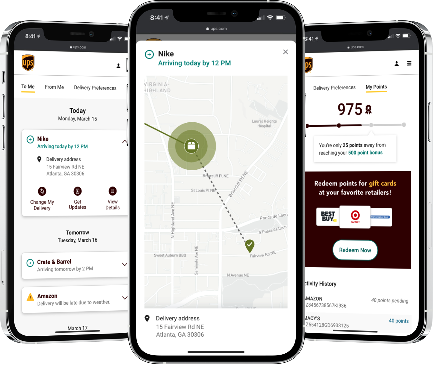
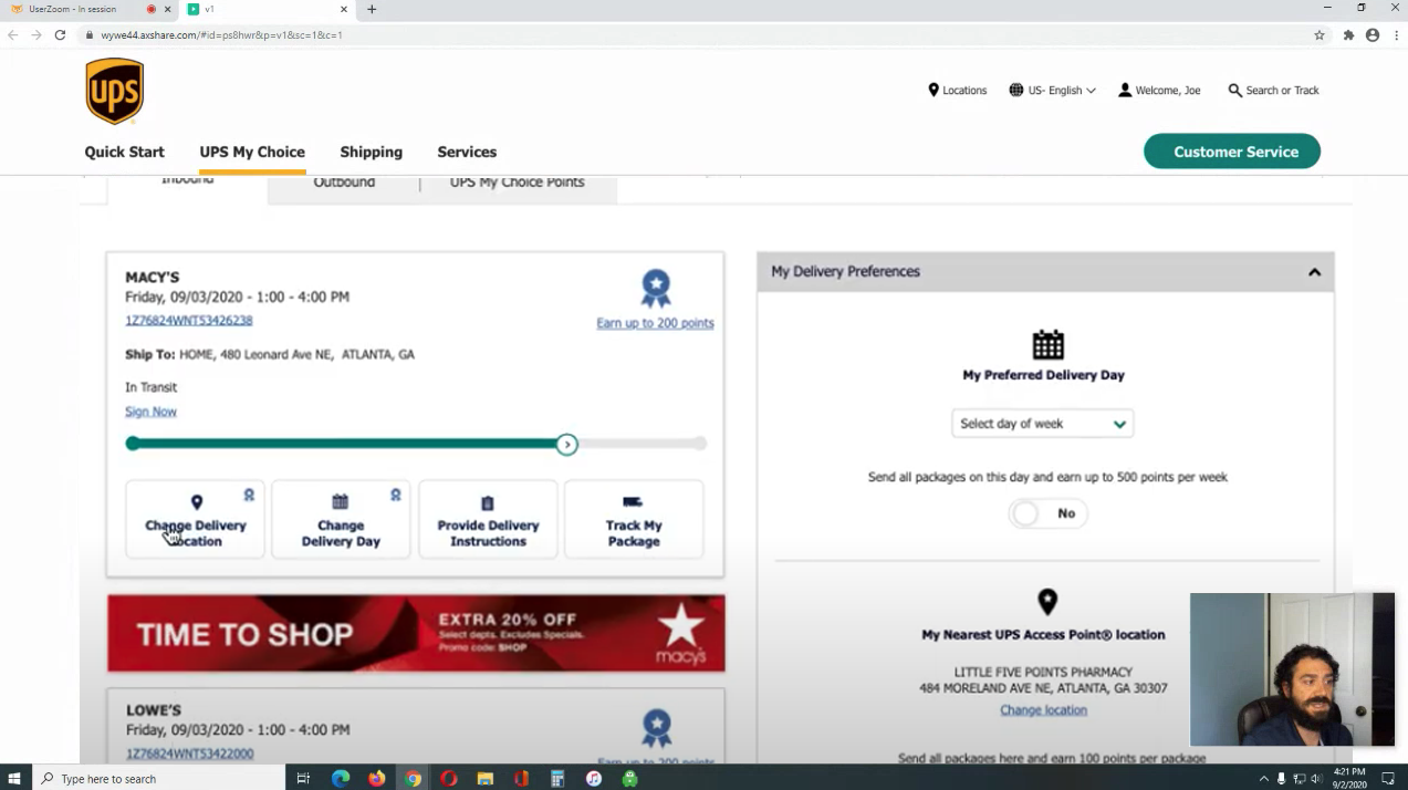
The individual tracking cards were at the top of our priority list for design. Our goal was to create a card that was succinct yet also contained pertinent information at a glance. We also needed a design solution that would allow customers to schedule delivery changes and receive notifications regarding the delivery status.
This process consisted of several work sessions as well as gathering feedback from research participants. The design went through several iterations over the course of the project until we were satisfied with the end result we would be delivering to customers.
Usability Testing
Over the next few sprints we were approaching a design that was nearing completion. To validate some of our design decisions and to ensure our hypotheses were correct, we conducted a remote usability study.
I worked closely with a design researcher to create the participant screener, interview questions, the tasks themselves, and setting up the study within User Zoom. User Zoom helped recruit our participants based on the screener we had provided. The participants consisted of the following:
15 participants
Had experience shopping online
Had at least some experience or knowledge about making delivery changes
Mix of male/female age 21-70
Evenly spread throughout the US
50/50 Desktop and mobile users
60/40 primarily UPS users
We felt that prototyping would yield the most meaningful results by being able to observe interactions, as if they were experiencing the application as a launched product. I created prototypes both for mobile and desktop in Axure and had participants split randomly into three groups, each containing five participants.
Each group interacted with a prototype that had unique design and interaction attributes. We asked participants to speak freely about what they were experiencing which helped giving us genuine insights. We also had them complete a series of tasks based on various interactions we had been debating in work sessions, as well as probing on various approaches to embedding marketing material, and observed their behavior and success rate.
"[The v2] banners feel like a straight up ad. I'm definitely not going to hit that. When it's on the side [v3], you think that it's probably unique to a UPS offers, or unique to your profile."
Rohan P.

"I was seeing that I can select a day of the week, and then I'm trying to look for an 'enter,' or 'submit,' but not finding that. It's not clear that it automatically updated."
Melody G.
We came out of the study with some very clear content, design, and interaction decisions. We were able to move forward with designs that would not make it difficult for users to find key actions, and would also encourage a higher increase in the likelihood of customers interacting with marketing material. Now armed with a plethora of user data and feedback, I was able to include our findings into the next iteration.
Introducing... UPS My Choice
Bringing it to life
I created prototypes using Adobe XD and also Axure to better experience and visualize the interactions. Sharing the prototypes were an essential visual communication tool during presentations with stakeholders. Showing interactions, rather than only explaining them, made a huge impact securing buy-in for our vision.
"Showing interactions, rather than only explaining them, made a huge impact securing buy-in for our vision."
Results
The newly redesigned UPS My Choice experience went live in July 2020 to approximately 5 million users and a rollout to a further 56 million users as the final migration in late October.
As of writing this case study, the affiliate marketing direction is one of the remaining pieces yet to go live. This approach completely redefines the marketing experience as a "premium" being offered exclusively to UPS My Choice customers. Besides the development undertaking, UPS needs to coordinate this new marketing program with its affiliate partners and request all new marketing content to fit this new structure. I am anxiously awaiting the day that this becomes live and we can measure its effectiveness.
Testimonials
"I have had the pleasure of working with Dennis for ~12 months on the UPS My Choice project. Dennis is a tremendous asset to our collaborative and cross functional team. With very vague and audacious goals, Dennis does a great job sifting through the noise, identifying the key moments, and develops compelling and thoughtful designs."
Bryan Yag
Strategy Sr. Manager, UPS
"Dennis has had an instrumental role in continuing to demonstrate T3's value to UPS this year. His work on UPS My Choice and the results that it drove for UPS speaks volumes and reflects incredibly well on him and T3."
Amy Rodriguez
Group Account Director, T3
See More Work
Site designed and developed by Dennis Go, © 2021. All rights reserved.