In 2018, one of UPS’ main initiatives was to become a primary resource for small businesses.
Between 2018 Q2 and 2019 Q4, I led the UX design of an application supporting this effort that would help thousands of small business realize their goals.
Role
Lead UX Designer
Duration
March 2018 - February 2019
Launch
July 2019
The Challenge
UPS' strategy for small businesses included an overarching vision of a platform that would link together several of UPS' core abilities including shipping, tracking and returns, and offering newer abilities like promoting the business and driving sales.
Since 2018, customer expectations for what a tracking application were changing, and not in ways that were conducive to applications UPS had built, like Quantum View Manage. Competitiion in this landscape had also dramatically changed.
UPS understood that they would need to enter the market quickly to provide easier access for early adopters. Working within an accelerated time frame that would allow sufficient time for development would mean needing to be extremely economical in terms of time spent for research as well and agreeing on design decisions.
The Team
I led the experience design and collaborated with an art director, a content strategist, and a front-end developer, and worked closely with a project manager. I presented all designs to various cross-departmental stakeholders.
Understanding Business Goals
I conducted stakeholder interviews to understand what UPS hoped to achieve with this undertaking. Some key insights in their strategy included:
Actual monetary values have been omitted
Target of 50k enrollments at launch
Increase and exceed target revenue
Reduce annual customer service call volume by 3.6% by 2021
Increase loyalty in small business customers
The business requirements stated that the application must live on the .com platform. This would help speed development since many of the components are already built. UPS.com is also AA accessibility compliant, meaning that this new product we would be designing would also need to meet AA standards.
Identifying Small Business Needs
Interviews were conducted by UPS with small business owners of many different business types. These are the primary insights that defined the launch of this application:
Timing Matters
Knowing when packages arrive can be crucial for time sensitive material
Proactive Communication
Customers expect retailers to resolve issues before being aware of them
Relevant notifications
53% of customers say changes in delivery date and damages are the most important notifications
Custom and personal
Rescheduling delivery and setting delivery time are the most important
Problem Statements
We created problem statements out of these initial insights. We used the "as a ___, I need ___ so that I can ___," format which is typical of how we form user stories and also satisfies providing context, describing the issue as well as describing the overall objective.
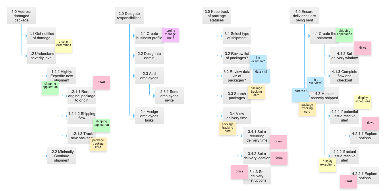
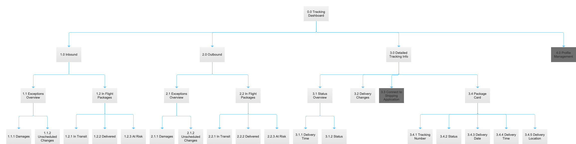
Hierarchical Task Analysis
Once we had the goals of small business owners in mind, we analyzed the tasks users would need to do in order to achieve their goals. This helped us to piece together and start to visualize what sort of application we would need to develop.
Across these different goals, we assigned larger groups that encompassed that specific task. At the end of the activity, we ended up with these main buckets, 1) displaying exceptions, 2) displaying package statuses, 3) displaying detailed package info, 4) initiating delivery changes, 5) initating new shipments, and 6) profile management.
"Documentation was a necessary part of the process that allowed us to reduce swirl and keep moving forward."
With limited time on our hands, we quickly came to an agreement of the overall structure of the application. I created a site map to document our decisions. Documentation was a necessary part of the process that allowed us to reduce swirl and keep moving forward. This was incredibly important given the accelerated time frame and our consistent need to deliver thoughtful and timely work.
We decided that the initial release would be a minimum viable product and that additional features would need to be added post launch. To us, minimum meant being able to achieve the goals we had defined.
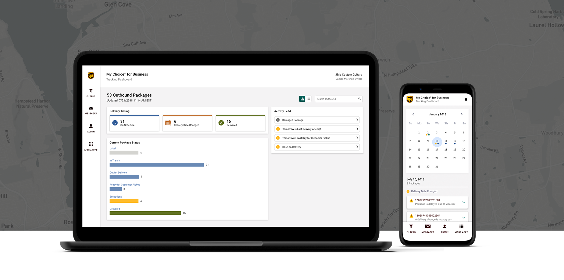
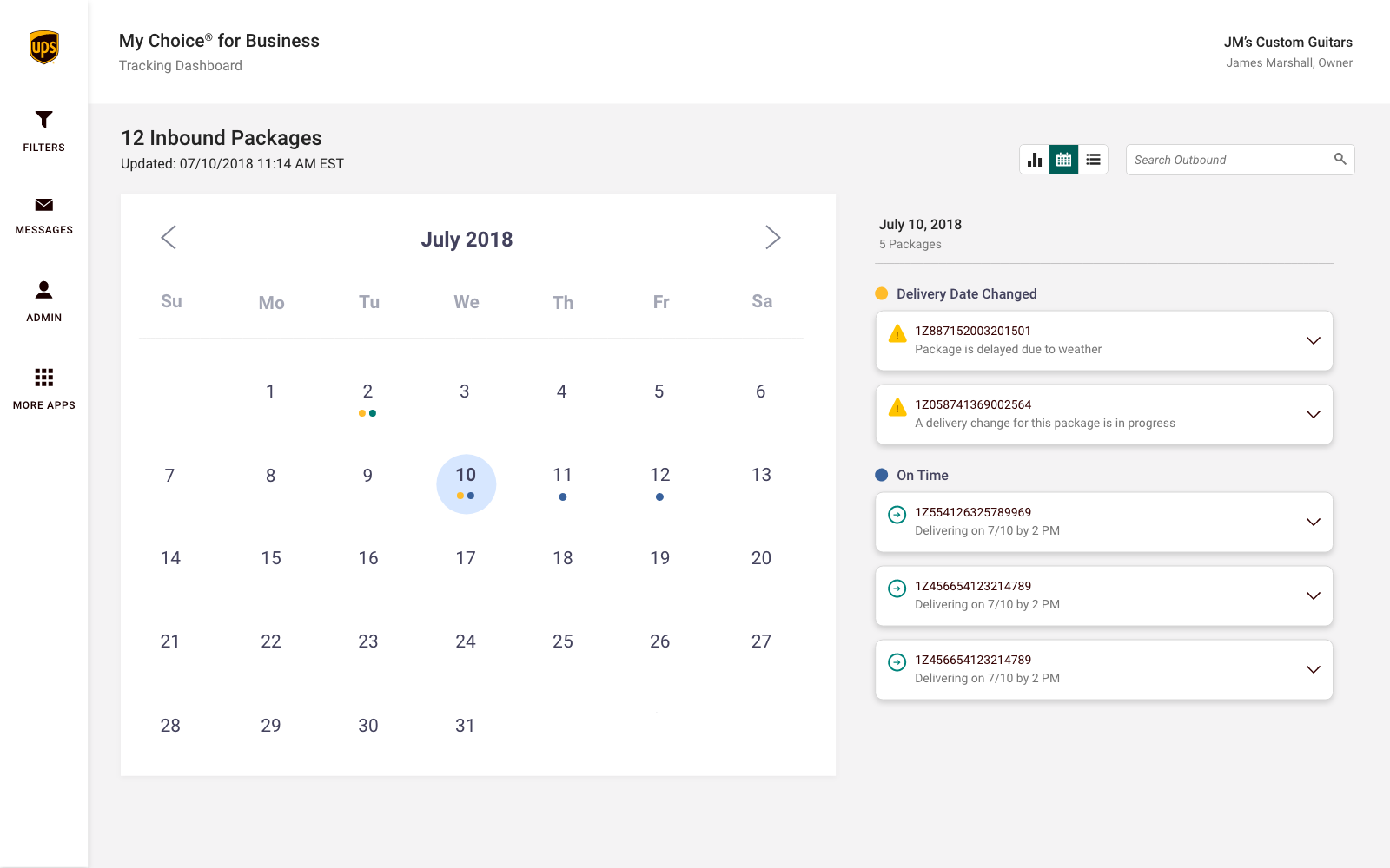
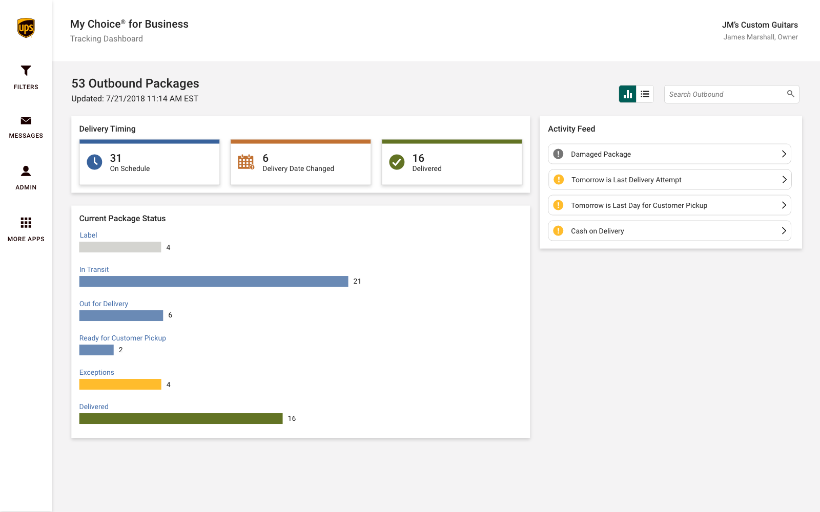
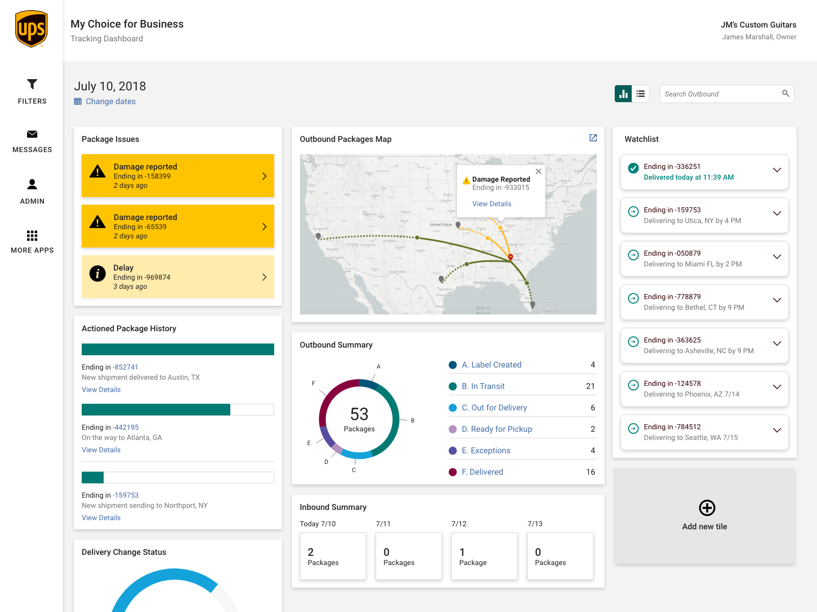
UPS My Choice® for Business: Tracking Dashboard
Monitor All of Your Shipments
Users have access to a quick high level view of all of their inbound and outbound shipments.
Go the extra mile for your customers
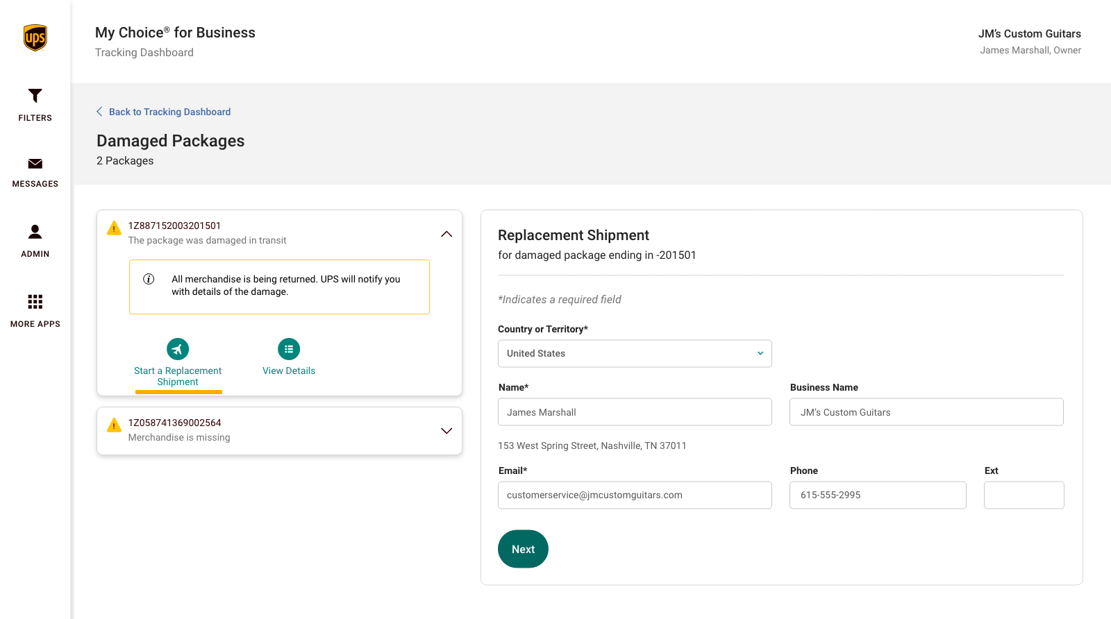
If there are impacts to the delivery date or the shipment, notifications will be sent and users can decide if additional actions need to be taken in order to deliver an exceptional customer experience.
Do more with more people
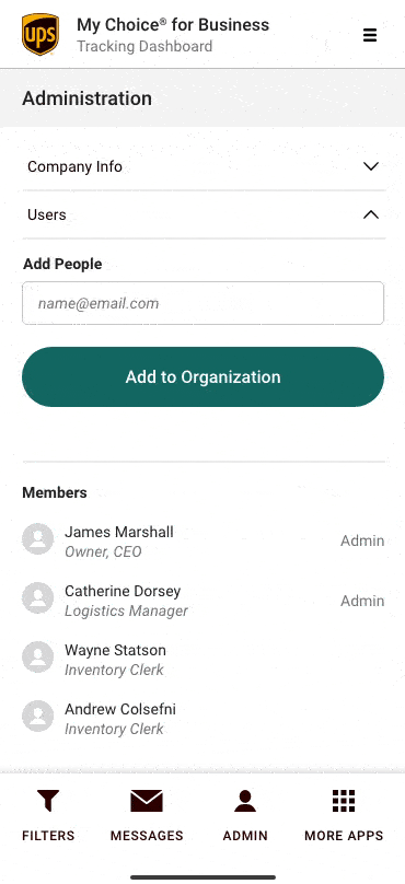
Create efficiencies within your company and make the best use of your time by adding user accounts and giving them essential abilities.
This video was created to promote the launch of UPS My Choice for Business.
The Design
The core design system had already been built which made transitioning from low fidelity wireframes into high fidelity comps and prototypes relatively simple. As new elements and compnents were needed, we expanded the design system accordingly.
Wires, comps and prototypes were built in Axure and also Adobe XD. Prototypes were very useful to visually communicate interactions and flows.
We needed to ensure that all of the data visualizations met AA accessibility standards. This meant ensuring that colors alone were not visual signifiers, ensuring colors were contrasting enough to be readable, meeting minimum font sizes, and other considerations.
We learned that users were primarily using their desktop devices to conduct business matters. As such, we still designed from a mobile-first perspective since we knew that the application would ultimately live on ups.com, a responsive website.
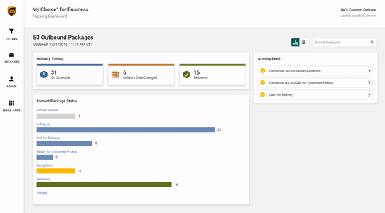
Dreams of customization
As part of our plan, we had decided to release the MVP version of the dashboard and gauge how users were interacting with it. One idea that persisted from the beginning was creating a customizable dashboard experience so that users can tune their display to what works best for them. Unfortunately, with the time and resources available for the MVP launch, creating a customizable experience was not within the project scope.
This proof of concept that I created depicts new modules that we had determined would be useful to customers and also shows the potential for how re-arranging the modules could help in customizing the dashboard. Users would be able to control which modules they see as well.
Challenges
UPS was extremely motivated to deliver a product to market as soon as possible. They had realized that their current offers simply did not meet the demands of customers' expectations in terms of tracking and dashboard tools. We had a fixed launched date which meant eneding to adhere to a process driven by the development team. As such, we were not afforded with the time or ability to conduct informative user research, which is ironically one of the main ways we could have saved time when informing design and making decisions.
Managing the design itself was incredibly difficult. Our team had been conducting usability studies throughout the lifecycle of the product development. However, the research methods employed did not form concrete conclusive results. As a result a disproportionate amount of meetings were spent debating design decisions, and entertaining individual opinions and personal preferences.
Reflection
It is always my goal to design with simplicity, usefulness, and intention. The craft and the details I put into the products I design are extremely important to me. Knowing where the improvements could have been made, which features should have been deployed, what the unaddressed usability issues are, all point to my disfavor about the product that was launched.
The product can only be as good as the team that produces it, and importantly, how we all arrived at the result. I am glad to know that the team came out of this stronger and wiser. The learning experiences they gained can (and continue to) carry on towards future releases and future projects.
At the end of the day, it boils down to how useful the product is and if it is being used at all. It boils down to fulfilling those business goals. Despite my critique on how this project went, the product was well received by the business; they exceeded their objectives and the application is a useful tool for small businesses all over the world.
Results
The application launched in July 2019 to 58,000 users. Today, the application is being used by thousands more small business users all over the world with recent launches in 30 countries in Europe, The Americas, and Asia Pacific.
Figures are reported as of April 2020.
*Horizon Award Winner in the Information Technology and Global Product Innovation categories.